
Animate.CSS – 用CSS就可以做出的動態特效
Animate.CSS是一款集合了多種CSS3動態效果的CSS檔,在使用上相當方便,只要直接在需要製作特效的標籤上載入指定的CSS類別,就可以快速做出動畫效果,不過要特別注意,也因為他是CSS3的動畫效果,所以IE的部分需要使用9以上的版本才可以閱讀喔。
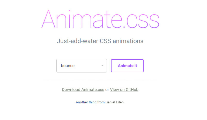
Animate 官網截圖
大家可以先到Animate官網下載Animate.css,下載完成後,將Animate.css載入至頁面中。
<link rel="stylesheet" type="text/css" href="animate.css">
準備完成後,可以直接對著想要做特效的標籤套上Animate的類別,類別名稱需與官網設定的名稱一樣,呈現特效的方式是在網頁載入完成後執行,下面是幾個簡單的範例。
參考Caroline製作bounceInDown效果:
<body>
  <div id="frog" class="animated bounceInDown" ></div>
</body>
參考Caroline製作zoomIn效果:
<div id="rainbow" class="animated zoomIn"></div>
參考Caroline製作的lightSpeedIn效果:
<div id="mrt" class="animated lightSpeedIn"></div>
搭配圖片後更可以呈現特效感覺。
接下來,我們還可以在指定物件,加入Animate的CSS來控制特效的時間,設定該物件特效的時間長短,例如彩虹,我們就可以讓它慢慢出現。
參考Caroline製作範例網頁:設定該物件特效過程的時間
<style>
*{ margin:0px; padding:px; border:none}

#rainbow{
  width:500px;
  height:164px;
  background-image:url(images/rainbow.png);
  -webkit-animation-duration: 3.5s;/*設定該物件特效過程的時間,3.5s代表3.5秒。*/
}
</style>
<div id="rainbow" class="animated zoomIn"></div>
參考Caroline製作範例網頁:設定該物件特效延遲多久出現,我們可以結合前面做的,效果更明顯。
<style>
#mrt{
  width:152px;
  height:62px;
  background-image:url(images/mrt.png);
  position:relative;
  bottom:100px;
  margin:auto;
  -webkit-animation-delay: 3.5s;/*指定該物件特效延遲開始,3.5s代表3.5秒。*/
}
</style>
<div id="mrt" class="animated lightSpeedIn"></div>
參考Caroline製作範例網頁:設定該物件特效次數。
<style>
#star{
  width:46px;
  height:45px;
  background-image:url(images/star1.png);
  -webkit-animation-iteration-count: infinite;/*設定該特效次數,infinite代表無限。*/
}
</style>
<div id="star" class="animated flash"></div>
懂得運用特效及時間的搭配後,就可以發揮你們的創意,做出喜歡的效果。
參考Caroline製作範例頁面:
物件很多,所以程式碼有點多,但其實都是很單純的CSS。
<style>
*{ padding:0px; margin:0px}
body{ background-color: #999;}
.clearLeft{ clear:left}
.floatLeft{ float: left}
#box{ width:1300px; height:800px; overflow:hidden; margin:auto; padding-top:30px;}
#cloud1{ width:130px; height:100px; background-image:url(images/cloud1.png); position:relative; left:-230px;-webkit-animation-duration: 20s;-webkit-animation-iteration-count: infinite;}/*設定雲朵特效過程長20秒,特效次數無限。*/
#cloud2{width:78px; height:63px; background-image:url(images/cloud2.png); position:relative; top:100px; right:-1300px;-webkit-animation-duration: 25s;-webkit-animation-iteration-count: infinite;}/*設定雲朵特效過程長25秒,特效次數無限*/
#cloud3{ width:130px; height:100px; background-image:url(images/cloud1.png); position:relative; top:200px; left:-330px;-webkit-animation-duration: 20s;-webkit-animation-iteration-count: infinite;-webkit-animation-delay: 2s;}/*設定雲朵特效過程長20秒,特效次數無限,且在頁面載入2秒後做特效*/

#star1{ width:45px; height:45px; background-image:url(images/star1.png);position:relative; left:50px;-webkit-animation-iteration-count: infinite;-webkit-animation-delay: 2s}/*設定星星特效次數無限,且在頁面載入2秒後做特效*/
#star2{ width:23px; height:23px; background-image:url(images/star2.png);position:relative; left:230px; top:80px;-webkit-animation-iteration-count: infinite;-webkit-animation-delay: 0.3s}/*設定星星特效次數無限,且在頁面載入0.3秒後做特效*/
#star3{ width:22px; height:22px; background-image:url(images/star3.png);position:relative; left:400px;-webkit-animation-iteration-count: infinite;-webkit-animation-delay: 0.5s }/*設定星星特效次數無限,且在頁面載入0.5秒後做特效*/
#star4{ width:41px; height:41px; background-image:url(images/star4.png);position:relative; left:580px ;top:100px; -webkit-animation-iteration-count: infinite;-webkit-animation-delay: 0.8s}/*設定星星特效次數無限,且在頁面載入0.8秒後做特效*/
#star5{ width:22px; height:23px; background-image:url(images/star5.png);position:relative; left:750px;top:50px; -webkit-animation-iteration-count: infinite;}/*設定星星特效次數無限*/
#panda{ width:166px; height:175px; background-image:url(images/panda2.png); position:relative; top:350px;-webkit-animation-delay: 3.0s}/*設定熊貓在頁面載入3.8秒後做特效*/
#frog{ width:159px; height:184px; background-image:url(images/frog2.png); position:relative; top:250px;-webkit-animation-delay: 4.1s}/*設定青蛙在頁面載入4.1秒後做特效*/
#taipei{ width:252px; height:442px; background-image:url(images/101.png);-webkit-animation-delay:4.9s;}/*設定101在頁面載入4.9秒後做特效*/
#ferriBox{ width:200px; height:270px; position:relative; top:5px; left:20px;-webkit-animation-delay:3.8s;}/*設定摩天輪在頁面載入3.8秒後做特效*/
#wheel{ width:199px; height:202px; background-image:url(images/wheel.png); position:relative; top:102px;left:-50px;}
#ferri{ width:82px; height:178px; background-image:url(images/ferri.png);}
#houseBox{-webkit-animation-delay:5s;}/*設定房子在頁面載入5秒後做特效*/
#heart1{ width:25px; height:23px; background-image:url(images/love1.png);margin-left:110px; margin-bottom:10px;-webkit-animation-delay:5.3s; }/*設定愛心在頁面載入5.3秒後做特效*/
#heart2{ width:33px; height:28px; background-image:url(images/love2.png);margin-left:80px; margin-bottom:20px;-webkit-animation-delay:5.9s;}/*設定愛心在頁面載入5.9秒後做特效*/
#heart3{ width:41px; height:41px; background-image:url(images/love3.png);margin-left:140px; -webkit-animation-delay:6.4s;}/*設定愛心在頁面載入6.4秒後做特效*/
#heart4{ width:60px; height:50px; background-image:url(images/love4.png);margin-left:70px; margin-bottom:10px;-webkit-animation-delay:7.0s;}/*設定愛心在頁面載入7.0秒後做特效*/
#heart5{ width:86px; height:84px; background-image:url(images/love5.png);margin-left:160px; margin-bottom:10px;-webkit-animation-delay:7.6s;}/*設定愛心在頁面載入7.6秒後做特效*/
#house{ width:116px; height:145px; background-image:url(images/house.png);margin-bottom:10px;}
#hello{ margin-top:25px; margin-left:8px;-webkit-animation-iteration-count: infinite;-webkit-animation-duration: 1.5s;}/*設定Hello特效次數無限,並且在頁面載入1.5秒後做特效*/
#bear{ width:187px; height:197px; background-image:url(images/bear.png); position:relative; top:340px;left:-160px;-webkit-animation-delay:4.4s}/*設定黑熊在頁面載入4.4秒後做特效*/
#balloonBox{-webkit-animation-delay:4.4s; position:relative}/*設定氣球在頁面載入4.4秒後做特效*/
#balloon{ width:78px; height:125px; background-image: url(images/balloon.png);position:relative; top:320px; left:-70px;-webkit-animation-delay:8.3s;-webkit-animation-duration: 20s; }/*設定氣球在頁面載入8.3秒後做特效,特效過程20秒*/
#rainbow{ width:1152px; height:378px; background-image:url(images/rainbowB.png); position:relative; bottom:100px;-webkit-animation-duration: 3.5s; }/*彩虹,設定特效過程3.5秒*/
</style>
<body>
<div id="box">
<div id="cloud1" class=" animated fadeInRightBig floatLeft"></div><!-- 使用fadeInRightBig是會從視窗外由右向左飛進來的效果-->
<div id="cloud2"class=" animated fadeInLeftBig floatLeft"></div>
<div id="cloud3" class=" animated fadeInRightBig floatLeft"></div>
<div id="star1"class=" animated flash clearLeft floatLeft"></div>
<div id="star2"class=" animated flash floatLeft"></div><!--flash 閃爍效果,可以運用在星星或閃光燈...上面-->
<div id="star3"class=" animated flash floatLeft"></div>
<div id="star4"class=" animated flash floatLeft"></div>
<div id="star5"class=" animated flash floatLeft"></div>
<div id="panda"class=" animated bounceInUp clearLeft floatLeft"></div><!--bounceInUp 熊貓彈上來的效果-->
<div id="frog"class=" animated bounceInDown floatLeft"></div><!--bounceInDown 青蛙跳下來的效果-->
<div id="taipei"class=" animated fadeIn floatLeft"></div><!--fadeIn 101淡入效果-->

<div id="ferriBox"class=" animated bounceIn floatLeft"><!--bounceIn 摩天輪彈進來的效果-->
 <div id="wheel" ></div>
 <div id="ferri"class=""></div>
</div>

<div id="houseBox"class=" animated zoomIn floatLeft"><!-- zoomIn 房子與愛心還有愛心上的字同時從遠到進的效果 -->
 <div id="heart5" class="animated fadeIn"><img class="animated tada" id="hello" src="images/hello.png" width="50" height="49"><!-- tada 設定Hello晃動的效果 --></div>
 <div id="heart4"class="animated fadeIn"></div><!-- fadeIn 設定愛心淡入的效果 -->
 <div id="heart3"class="animated fadeIn"></div>
 <div id="heart2"class="animated fadeIn"></div>
 <div id="heart1"class="animated fadeIn"></div>
 <div id="house"></div>
</div>
<!-- 為了讓氣球跟熊可以一起出現,最後氣球還可以飛到天上,所以用多個DIV包住,設定不同特效及時間。-->
<div id="balloonBox" class="animated bounceInRight floatLeft"><!--bounceInRight 氣球由右往左彈入效果-->
 <div id="balloon"class=" animated fadeOutUpBig floatLeft"></div><!--fadeOutUpBig 氣球往上飛效果-->
</div>

<div id="bear" class="animated bounceInRight floatLeft"></div><!--bounceInRight 黑熊由右往左彈入效果-->

<div id="rainbow" class="animated zoomIn clearLeft"></div><!--zoomIn 彩虹由遠到近的效果-->
</div>
</body>
最後,下面是幫大家整理出所有Animate的類別。
| bounce | bounceIn | bounceOutRight | fadeInRightBig |
| flash | bounceInDown | bounceOutUp | fadeInUp |
| pulse | bounceInLeft | fadeIn | fadeInUpBig |
| rubberBand | bounceInRight | fadeInDown | fadeOut |
| shake | bounceInUp | fadeInDownBig | fadeOutDown |
| swing | bounceOut | fadeInLeft | fadeOutDownBig |
| tada | bounceOutDown | fadeInLeftBig | fadeOutLeft |
| wobble | bounceOutLeft | fadeInRight | fadeOutLeftBig |
| flipInX | rotateIn | fadeOutUp | fadeOutUpBig |
| flipInY | rotateInDownLeft | rotateOutDownLeft | rollIn |
| flipOutX | rotateInDownRight | rotateOutDownRight | rollOut |
| flipOutY | rotateInUpLeft | rotateOutUpLeft | zoomIn |
| lightSpeedIn | rotateInUpRight | rotateOutUpRight | zoomInDown |
| lightSpeedOut | rotateOut | hinge | zoomInLeft |
| slideInDown | slideOutDown | zoomOutDown | zoomInRight |
| slideInLeft | slideOutLeft | zoomOutLeft | zoomInUp |
| slideInRight | slideOutRight | zoomOutRight | zoomOut |
| slideInUp | slideOutUp | zoomOutUp |

Hey there! This post couldn’t be written any better! Reading through this post reminds
me of my old room mate! He always kept chatting about this.
I will forward this write-up to him. Fairly certain he will have a good read.
Thank you for sharing!
I visited various web pages but the audio quality for audio songs existing at this website is in fact superb.
Thankfulness to my father who shared with me concerning this website, this website is really
remarkable.
USA India Pharm: USA India Pharm – UsaIndiaPharm
Ощутите себя капитаном, отправившись в незабываемое плавание!
К вашим услугам
теплоходы казань в аренду для захватывающих
приключений.
С нами вы сможете:
• Насладиться живописными пейзажами с борта различных судов.
• Отпраздновать знаменательное событие в
необычной обстановке.
• Провести незабываемый вечер в романтической атмосфере.
• Собраться с близкими друзьями для веселого время провождения.
Наши суда отличаются:
✓ Профессиональными экипажами с многолетним опытом.
✓ Повышенным уровнем комфорта для пассажиров.
✓ Гарантией безопасности на протяжении всей поездки.
✓ Привлекательным внешним видом и стильным дизайном.
Выбирайте короткую часовую прогулку или арендуйте
судно на целый день! Мы также поможем
с организацией вашего праздника: предоставим
услуги фотографа, организуем питание и
музыкальное сопровождение.
Подарите себе и своим близким
незабываемые моменты! Забронируйте вашу водную феерию уже сегодня!
1win официальный [url=http://1win6048.ru]http://1win6048.ru[/url] .
Hi there, I discovered your site by means of Google whilst searching
for a similar topic, your web site got here up,
it looks good. I’ve bookmarked it in my google bookmarks.
Hi there, just turned into alert to your weblog via Google, and located that it’s truly informative.
I am going to be careful for brussels. I will appreciate for those who proceed this in future.
Lots of other people will probably be benefited from your writing.
Cheers!
мрстбет [url=http://mostbet6033.ru/]http://mostbet6033.ru/[/url] .
mostbet.kg [url=mostbet6033.ru]mostbet6033.ru[/url] .
mostbets [url=https://mostbet6033.ru]https://mostbet6033.ru[/url] .
Где заказать диплом по необходимой специальности?
Мы предлагаем быстро и выгодно купить диплом, который выполнен на оригинальном бланке и заверен мокрыми печатями, водяными знаками, подписями официальных лиц. Наш документ пройдет лубую проверку, даже при помощи специфических приборов. Решайте свои задачи максимально быстро с нашими дипломами.
Заказать диплом ВУЗа [url=http://poluchidiplom.com/kupit-diplom-elektromontera-9/]poluchidiplom.com/kupit-diplom-elektromontera-9/[/url]
1win официальный сайт регистрация [url=1win7014.ru]1win7014.ru[/url] .
Online medicine order [url=http://usaindiapharm.com/#]UsaIndiaPharm[/url] reputable indian pharmacies
1win зайти [url=https://1win7002.ru]https://1win7002.ru[/url] .
wan win [url=https://1win7002.ru/]https://1win7002.ru/[/url] .
Discover thousands of the latest and popular films from various genres.
Enjoy high-quality movie streaming experience without
any subscription needed.
Приобрести диплом ВУЗа по невысокой стоимости возможно, обращаясь к надежной специализированной фирме. Заказать документ о получении высшего образования можно у нас. [url=http://kupitediplom0027.ru/kupit-diplom-s-zaneseniem-12/]kupitediplom0027.ru/kupit-diplom-s-zaneseniem-12[/url]
Заказать диплом университета по доступной стоимости возможно, обращаясь к проверенной специализированной компании. Купить документ ВУЗа можно у нас в Москве. [url=http://kupitediplom.ru/kupit-diplom-v-reestre-bistro-i-nadezhno-6/]kupitediplom.ru/kupit-diplom-v-reestre-bistro-i-nadezhno-6[/url]
india online pharmacy: USA India Pharm – online pharmacy india
Приобрести диплом ВУЗа по невысокой стоимости можно, обращаясь к надежной специализированной фирме. Заказать документ института вы имеете возможность у нас в Москве. [url=http://fastdiploms.com/kupit-diplom-s-zaneseniem-v-reestr-rossii-prosto-i-bistro/]fastdiploms.com/kupit-diplom-s-zaneseniem-v-reestr-rossii-prosto-i-bistro[/url]
Having read this I thought it was extremely informative.
I appreciate you taking the time and effort to put this short article together.
I once again find myself personally spending a significant amount of time both
reading and leaving comments. But so what, it was still
worth it!
https://usaindiapharm.shop/# USA India Pharm
I savor, result in I discovered exactly what I was having a look for.
You have ended my four day lengthy hunt!
God Bless you man. Have a great day. Bye
мостбет войти [url=https://mostbet6033.ru]https://mostbet6033.ru[/url] .
mostbets [url=https://mostbet6033.ru]mostbets[/url] .
aviator mostbet [url=https://mostbet6033.ru/]https://mostbet6033.ru/[/url] .
top 10 online pharmacy in india: UsaIndiaPharm – indian pharmacies safe
I am really grateful to the owner of this web site who has shared this impressive paragraph at at this place.
I absolutely love your blog and find most of your post’s to be exactly what I’m looking for.
can you offer guest writers to write content for yourself?
I wouldn’t mind publishing a post or elaborating on a few of the
subjects you write regarding here. Again, awesome weblog!
online pharmacy india: top 10 online pharmacy in india – USA India Pharm