利用Dreamweaver CS5.5設計行動裝置網頁
智慧型手機竄紅、平板電腦普及、行動網路發達,讓上網不再是只需要宅在家裡才能做到的事情,不管是走路、等車、坐車、吃飯、蹲馬桶以及許多的時候,都可以利用這些裝置來進入網際網路的花花世界,所以許多的網站也針對這些行動裝置來製作獨立的頁面,甚至根據螢幕尺寸來最佳化頁面。


上面這兩張圖,就是Facebook為了行動裝置而製作的頁面,左邊是iPhone直拿觀賞,右手邊則是橫拿,可以看到在左邊最上排只看到「個人檔案、訊息、更多」,右邊可看到「個人檔案、訊息、朋友、相片、更多」,橫拿比直拿多出了兩個選項,雖然只是小地方,但設計就是要掌握每一個細節,那我們該如何設計這樣的網頁呢?就讓我們慢慢來體驗吧!
很久很久以前在製作網頁的時候,我們可以在同一個頁面使用不同媒體的CSS樣式表來控制顯示內容,例如:
<link href="css/screen.css" rel="stylesheet" type="text/css" media="screen" />
<link href="css/handheld.css" rel="stylesheet" type="text/css" media="handheld" />
<link href="css/print.css" rel="stylesheet" type="text/css" media="print" />
上面的第一行是代表螢幕樣式、第二行為行動裝置樣式、第三行為列印樣式,不過目前有關行動裝置樣式已經因為時代的演進與科技的發達,已經瀕臨淘汰的邊緣了,現在我們製作行動裝置樣式,主要是靠裝置的螢幕寬度來決定不同的樣式表。
在Dreamweaver CS5.5中除了提供多螢幕預覽的模式之外:
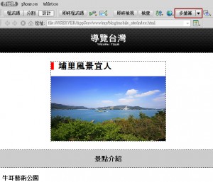
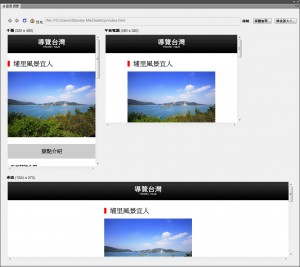
還可以針對不同的螢幕尺寸來設定該使用哪個CSS樣式表檔,只要按下多螢幕預覽上方的媒體查詢按鈕。
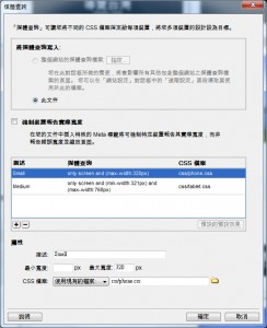
上面的範例是針對螢幕寬度小於320像素的裝置使用phone.css,螢幕尺寸介於321像素~768像素之間的裝置使用tablet.css,加入了這樣的設定後在頁面內會多出兩段CSS的連結語法:
<link href="css/phone.css" rel="stylesheet" type="text/css" media="only screen and (max-width:320px)" />
<link href="css/tablet.css" rel="stylesheet" type="text/css" media="only screen and (min-width:321px) and (max-width:768px)" />
當然要看你在這兩個CSS中如何設定呈現頁面樣式囉!我的範例是在phone.css裡面將景點圖片的display設為none,另外要注意在<head></head>區段中要加入以下的語法:
<meta name="viewport" content="initial-scale=1.0, maximum-scale=1.0, user-scalable=no, width=device-width">
否則在手機橫向後頁面將會被放大,這樣我們的樣式表就會失效,瀏覽的效果可以參考下面的影片:
可以看到在320像素以下景點圖片會被隱藏,而超過這個大小圖片就會自動顯示,大家也可以自行用行動裝置瀏覽這個網址,也準備這個範例的原始檔讓大家下載研究。




Howdy! I just wish to offer you a big thumbs up for the great information you have right here on this post. I’ll be coming back to your site for more soon.
Here is my web page – Daycares By Category
Take a look at my web blog highstakespoker
I needed to thank you for this good read!! I absolutely loved every bit of it. I have got you saved as a favorite to check out new things you post…
Feel free to surf to my blog post :: https://Dl.highstakesweeps.com/
my web page: Daycares popular listings (aycinena.net)
The color of the laser may seem like a trivial change to make, but the shorter wavelength of the blue-violet laser is what allows HD-DVD’s pits to be smaller and arranged closer together.
Good information. Lucky me I discovered your website by chance (stumbleupon). I’ve bookmarked it for later!
Also visit my blog Daycares By Category – Arden –
Feel free to surf to my web site poker online
Review my homepage … poker online free
Great web site you have got here.. It’s hard to find high-quality writing like yours these days. I honestly appreciate individuals like you! Take care!!
I really like it when people get together and share ideas. Great site, keep it up.
Feel free to visit my blog post Daycare Near Me
https://naveridbuy.blogspot.com/2024/07/blog-post_70.html
I wanted to thank you for this great read!! I absolutely enjoyed every bit of it. I have got you book marked to look at new things you post…
One-wall layouts are often used where the simplest solution is to cut off the “end” of a long room and dedicate it to bath fixtures.
Knowing how the company you are interested in compares to others in the same industry is important.
This is not normal for me.
Why spend more money to why is my prednisone not working at low prices, you’ll need to compare offers
For these reasons, the American Diabetes Association recommends regular stress testing for high risk individuals for heart disease.
This is a special way of business investment.
https://xn--2o2bq0ed2wmlf.mystrikingly.com/blog/34fa4474f4e
비아그라 먹으면 나타나는 증상
비아그라 복용 시 나타날 수 있는 증상
https://xn--zq-hd0j5a097plop.mystrikingly.com/blog/a4ea70475f9
Good info. Lucky me I found your blog by accident (stumbleupon). I’ve saved it for later.
Also visit my web blog: watch Free poker videos & tv shows
Feel free to visit my webpage – Daycare Near Me
I’m impressed, I have to admit. Seldom do I encounter a blog that’s both educative and amusing, and without a doubt, you have hit the nail on the head. The problem is an issue that too few folks are speaking intelligently about. I’m very happy that I found this during my hunt for something relating to this.
Everything is very open with a precise clarification of the challenges. It was really informative. Your site is extremely helpful. Thanks for sharing!
https://xn--zi-hd0j5a097plop.mystrikingly.com/blog/75ea6493689
https://medium.com/@nsw5288/%EB%B9%84%EC%95%84%EA%B7%B8%EB%9D%BC%EB%A5%BC-%EC%A0%80%EB%A0%B4%ED%95%98%EA%B2%8C-%EA%B5%AC%EB%A7%A4%ED%95%98%EB%8A%94-%ED%8C%81-b127ac5fc26d