
利用Dreamweaver CS5.5設計行動裝置網頁
智慧型手機竄紅、平板電腦普及、行動網路發達,讓上網不再是只需要宅在家裡才能做到的事情,不管是走路、等車、坐車、吃飯、蹲馬桶以及許多的時候,都可以利用這些裝置來進入網際網路的花花世界,所以許多的網站也針對這些行動裝置來製作獨立的頁面,甚至根據螢幕尺寸來最佳化頁面。


上面這兩張圖,就是Facebook為了行動裝置而製作的頁面,左邊是iPhone直拿觀賞,右手邊則是橫拿,可以看到在左邊最上排只看到「個人檔案、訊息、更多」,右邊可看到「個人檔案、訊息、朋友、相片、更多」,橫拿比直拿多出了兩個選項,雖然只是小地方,但設計就是要掌握每一個細節,那我們該如何設計這樣的網頁呢?就讓我們慢慢來體驗吧!
很久很久以前在製作網頁的時候,我們可以在同一個頁面使用不同媒體的CSS樣式表來控制顯示內容,例如:
<link href="css/screen.css" rel="stylesheet" type="text/css" media="screen" />
<link href="css/handheld.css" rel="stylesheet" type="text/css" media="handheld" />
<link href="css/print.css" rel="stylesheet" type="text/css" media="print" />
上面的第一行是代表螢幕樣式、第二行為行動裝置樣式、第三行為列印樣式,不過目前有關行動裝置樣式已經因為時代的演進與科技的發達,已經瀕臨淘汰的邊緣了,現在我們製作行動裝置樣式,主要是靠裝置的螢幕寬度來決定不同的樣式表。
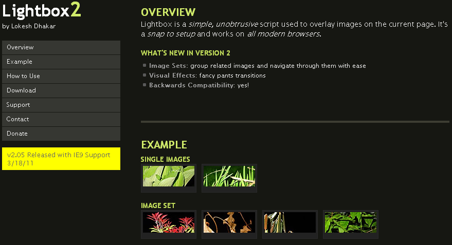
在Dreamweaver CS5.5中除了提供多螢幕預覽的模式之外:


還可以針對不同的螢幕尺寸來設定該使用哪個CSS樣式表檔,只要按下多螢幕預覽上方的媒體查詢按鈕。

上面的範例是針對螢幕寬度小於320像素的裝置使用phone.css,螢幕尺寸介於321像素~768像素之間的裝置使用tablet.css,加入了這樣的設定後在頁面內會多出兩段CSS的連結語法:
<link href="css/phone.css" rel="stylesheet" type="text/css" media="only screen and (max-width:320px)" />
<link href="css/tablet.css" rel="stylesheet" type="text/css" media="only screen and (min-width:321px) and (max-width:768px)" />
當然要看你在這兩個CSS中如何設定呈現頁面樣式囉!我的範例是在phone.css裡面將景點圖片的display設為none,另外要注意在<head></head>區段中要加入以下的語法:
<meta name="viewport" content="initial-scale=1.0, maximum-scale=1.0, user-scalable=no, width=device-width">
否則在手機橫向後頁面將會被放大,這樣我們的樣式表就會失效,瀏覽的效果可以參考下面的影片:
可以看到在320像素以下景點圖片會被隱藏,而超過這個大小圖片就會自動顯示,大家也可以自行用行動裝置瀏覽這個網址,也準備這個範例的原始檔讓大家下載研究。


Feel free to surf to my page … Find top-rated certified Daycares in your area (Swen)
Here is my page … Find top-rated certified Daycares in your area
Feel free to visit my web-site … Daycare Near Me – http://www.circlepix.com,
https://cinnamon-mushroom-dc4vl3.mystrikingly.com/blog/83776e36308
https://warm-anemone-dc4vlb.mystrikingly.com/blog/2f7df0157da
시알리스 비아그라 차이
시알리스와 비아그라: 차이와 어떤 것을 선택해야 할까?
Also visit my blog post :: Daycare Near Me By State
pfizer 비아그라
pfizer 비아그라의 역사: 발견에서 글로벌 인기까지
https://logical-dolphin-dc4vls.mystrikingly.com/blog/fe7970464ee
My webpage; Daycare Near Me
Also visit my page :: Explore Daycares Locations
Feel free to surf to my web blog – High Stakes Casino
The next time I read a blog, Hopefully it does not fail me as much as this particular one. I mean, Yes, it was my choice to read through, however I truly thought you’d have something useful to say. All I hear is a bunch of crying about something you could fix if you weren’t too busy seeking attention.
https://impartial-antelope-dc4vlb.mystrikingly.com/blog/fcb273ca262
https://www.mixcloud.com/shepparduvg897/
My web-site … Daycare Near Me
Also visit my blog – Explore Daycares Locations
Feel free to visit my page Daycare Near Me – Find The Best Daycares Near You
My homepage: best online poker sites
https://xn--kk-ro2i3ru49at1jokm7ma.mystrikingly.com/blog/ae87512970e
my page online Poker tournaments
https://diplomatic-shrimp-dbgzh2.mystrikingly.com/blog/079e4cac293
Look into my blog: High Stakes game
https://medium.com/@dqvchristopherwhite824/%EB%84%A4%EC%9D%B4%EB%B2%84-%EC%95%84%EC%9D%B4%EB%94%94%EB%A1%9C-%EC%B9%B4%ED%8E%98-%ED%99%9C%EB%8F%99%ED%95%98%EA%B8%B0-2772513471fc
my homepage – Daycare Near Me By State
сервисные центры по ремонту мобильных телефонов
Look into my web-site :: Explore Daycares Locations
how to buy probenecid – carbamazepine online order generic tegretol
I appreciate the effort you’ve put into this.프라그마틱
Good post. I learn something totally new and challenging on sites I stumbleupon on a daily basis. It will always be helpful to read through content from other authors and use a little something from other websites.