
Animate.CSS – 用CSS就可以做出的動態特效
Animate.CSS是一款集合了多種CSS3動態效果的CSS檔,在使用上相當方便,只要直接在需要製作特效的標籤上載入指定的CSS類別,就可以快速做出動畫效果,不過要特別注意,也因為他是CSS3的動畫效果,所以IE的部分需要使用9以上的版本才可以閱讀喔。
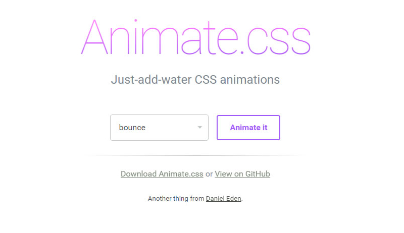
Animate 官網截圖
大家可以先到Animate官網下載Animate.css,下載完成後,將Animate.css載入至頁面中。
<link rel="stylesheet" type="text/css" href="animate.css">
準備完成後,可以直接對著想要做特效的標籤套上Animate的類別,類別名稱需與官網設定的名稱一樣,呈現特效的方式是在網頁載入完成後執行,下面是幾個簡單的範例。
參考Caroline製作bounceInDown效果:
<body>
  <div id="frog" class="animated bounceInDown" ></div>
</body>
參考Caroline製作zoomIn效果:
<div id="rainbow" class="animated zoomIn"></div>
參考Caroline製作的lightSpeedIn效果:
<div id="mrt" class="animated lightSpeedIn"></div>
搭配圖片後更可以呈現特效感覺。
接下來,我們還可以在指定物件,加入Animate的CSS來控制特效的時間,設定該物件特效的時間長短,例如彩虹,我們就可以讓它慢慢出現。
參考Caroline製作範例網頁:設定該物件特效過程的時間
<style>
*{ margin:0px; padding:px; border:none}

#rainbow{
  width:500px;
  height:164px;
  background-image:url(images/rainbow.png);
  -webkit-animation-duration: 3.5s;/*設定該物件特效過程的時間,3.5s代表3.5秒。*/
}
</style>
<div id="rainbow" class="animated zoomIn"></div>
參考Caroline製作範例網頁:設定該物件特效延遲多久出現,我們可以結合前面做的,效果更明顯。
<style>
#mrt{
  width:152px;
  height:62px;
  background-image:url(images/mrt.png);
  position:relative;
  bottom:100px;
  margin:auto;
  -webkit-animation-delay: 3.5s;/*指定該物件特效延遲開始,3.5s代表3.5秒。*/
}
</style>
<div id="mrt" class="animated lightSpeedIn"></div>
參考Caroline製作範例網頁:設定該物件特效次數。
<style>
#star{
  width:46px;
  height:45px;
  background-image:url(images/star1.png);
  -webkit-animation-iteration-count: infinite;/*設定該特效次數,infinite代表無限。*/
}
</style>
<div id="star" class="animated flash"></div>
懂得運用特效及時間的搭配後,就可以發揮你們的創意,做出喜歡的效果。
參考Caroline製作範例頁面:
物件很多,所以程式碼有點多,但其實都是很單純的CSS。
<style>
*{ padding:0px; margin:0px}
body{ background-color: #999;}
.clearLeft{ clear:left}
.floatLeft{ float: left}
#box{ width:1300px; height:800px; overflow:hidden; margin:auto; padding-top:30px;}
#cloud1{ width:130px; height:100px; background-image:url(images/cloud1.png); position:relative; left:-230px;-webkit-animation-duration: 20s;-webkit-animation-iteration-count: infinite;}/*設定雲朵特效過程長20秒,特效次數無限。*/
#cloud2{width:78px; height:63px; background-image:url(images/cloud2.png); position:relative; top:100px; right:-1300px;-webkit-animation-duration: 25s;-webkit-animation-iteration-count: infinite;}/*設定雲朵特效過程長25秒,特效次數無限*/
#cloud3{ width:130px; height:100px; background-image:url(images/cloud1.png); position:relative; top:200px; left:-330px;-webkit-animation-duration: 20s;-webkit-animation-iteration-count: infinite;-webkit-animation-delay: 2s;}/*設定雲朵特效過程長20秒,特效次數無限,且在頁面載入2秒後做特效*/

#star1{ width:45px; height:45px; background-image:url(images/star1.png);position:relative; left:50px;-webkit-animation-iteration-count: infinite;-webkit-animation-delay: 2s}/*設定星星特效次數無限,且在頁面載入2秒後做特效*/
#star2{ width:23px; height:23px; background-image:url(images/star2.png);position:relative; left:230px; top:80px;-webkit-animation-iteration-count: infinite;-webkit-animation-delay: 0.3s}/*設定星星特效次數無限,且在頁面載入0.3秒後做特效*/
#star3{ width:22px; height:22px; background-image:url(images/star3.png);position:relative; left:400px;-webkit-animation-iteration-count: infinite;-webkit-animation-delay: 0.5s }/*設定星星特效次數無限,且在頁面載入0.5秒後做特效*/
#star4{ width:41px; height:41px; background-image:url(images/star4.png);position:relative; left:580px ;top:100px; -webkit-animation-iteration-count: infinite;-webkit-animation-delay: 0.8s}/*設定星星特效次數無限,且在頁面載入0.8秒後做特效*/
#star5{ width:22px; height:23px; background-image:url(images/star5.png);position:relative; left:750px;top:50px; -webkit-animation-iteration-count: infinite;}/*設定星星特效次數無限*/
#panda{ width:166px; height:175px; background-image:url(images/panda2.png); position:relative; top:350px;-webkit-animation-delay: 3.0s}/*設定熊貓在頁面載入3.8秒後做特效*/
#frog{ width:159px; height:184px; background-image:url(images/frog2.png); position:relative; top:250px;-webkit-animation-delay: 4.1s}/*設定青蛙在頁面載入4.1秒後做特效*/
#taipei{ width:252px; height:442px; background-image:url(images/101.png);-webkit-animation-delay:4.9s;}/*設定101在頁面載入4.9秒後做特效*/
#ferriBox{ width:200px; height:270px; position:relative; top:5px; left:20px;-webkit-animation-delay:3.8s;}/*設定摩天輪在頁面載入3.8秒後做特效*/
#wheel{ width:199px; height:202px; background-image:url(images/wheel.png); position:relative; top:102px;left:-50px;}
#ferri{ width:82px; height:178px; background-image:url(images/ferri.png);}
#houseBox{-webkit-animation-delay:5s;}/*設定房子在頁面載入5秒後做特效*/
#heart1{ width:25px; height:23px; background-image:url(images/love1.png);margin-left:110px; margin-bottom:10px;-webkit-animation-delay:5.3s; }/*設定愛心在頁面載入5.3秒後做特效*/
#heart2{ width:33px; height:28px; background-image:url(images/love2.png);margin-left:80px; margin-bottom:20px;-webkit-animation-delay:5.9s;}/*設定愛心在頁面載入5.9秒後做特效*/
#heart3{ width:41px; height:41px; background-image:url(images/love3.png);margin-left:140px; -webkit-animation-delay:6.4s;}/*設定愛心在頁面載入6.4秒後做特效*/
#heart4{ width:60px; height:50px; background-image:url(images/love4.png);margin-left:70px; margin-bottom:10px;-webkit-animation-delay:7.0s;}/*設定愛心在頁面載入7.0秒後做特效*/
#heart5{ width:86px; height:84px; background-image:url(images/love5.png);margin-left:160px; margin-bottom:10px;-webkit-animation-delay:7.6s;}/*設定愛心在頁面載入7.6秒後做特效*/
#house{ width:116px; height:145px; background-image:url(images/house.png);margin-bottom:10px;}
#hello{ margin-top:25px; margin-left:8px;-webkit-animation-iteration-count: infinite;-webkit-animation-duration: 1.5s;}/*設定Hello特效次數無限,並且在頁面載入1.5秒後做特效*/
#bear{ width:187px; height:197px; background-image:url(images/bear.png); position:relative; top:340px;left:-160px;-webkit-animation-delay:4.4s}/*設定黑熊在頁面載入4.4秒後做特效*/
#balloonBox{-webkit-animation-delay:4.4s; position:relative}/*設定氣球在頁面載入4.4秒後做特效*/
#balloon{ width:78px; height:125px; background-image: url(images/balloon.png);position:relative; top:320px; left:-70px;-webkit-animation-delay:8.3s;-webkit-animation-duration: 20s; }/*設定氣球在頁面載入8.3秒後做特效,特效過程20秒*/
#rainbow{ width:1152px; height:378px; background-image:url(images/rainbowB.png); position:relative; bottom:100px;-webkit-animation-duration: 3.5s; }/*彩虹,設定特效過程3.5秒*/
</style>
<body>
<div id="box">
<div id="cloud1" class=" animated fadeInRightBig floatLeft"></div><!-- 使用fadeInRightBig是會從視窗外由右向左飛進來的效果-->
<div id="cloud2"class=" animated fadeInLeftBig floatLeft"></div>
<div id="cloud3" class=" animated fadeInRightBig floatLeft"></div>
<div id="star1"class=" animated flash clearLeft floatLeft"></div>
<div id="star2"class=" animated flash floatLeft"></div><!--flash 閃爍效果,可以運用在星星或閃光燈...上面-->
<div id="star3"class=" animated flash floatLeft"></div>
<div id="star4"class=" animated flash floatLeft"></div>
<div id="star5"class=" animated flash floatLeft"></div>
<div id="panda"class=" animated bounceInUp clearLeft floatLeft"></div><!--bounceInUp 熊貓彈上來的效果-->
<div id="frog"class=" animated bounceInDown floatLeft"></div><!--bounceInDown 青蛙跳下來的效果-->
<div id="taipei"class=" animated fadeIn floatLeft"></div><!--fadeIn 101淡入效果-->

<div id="ferriBox"class=" animated bounceIn floatLeft"><!--bounceIn 摩天輪彈進來的效果-->
 <div id="wheel" ></div>
 <div id="ferri"class=""></div>
</div>

<div id="houseBox"class=" animated zoomIn floatLeft"><!-- zoomIn 房子與愛心還有愛心上的字同時從遠到進的效果 -->
 <div id="heart5" class="animated fadeIn"><img class="animated tada" id="hello" src="images/hello.png" width="50" height="49"><!-- tada 設定Hello晃動的效果 --></div>
 <div id="heart4"class="animated fadeIn"></div><!-- fadeIn 設定愛心淡入的效果 -->
 <div id="heart3"class="animated fadeIn"></div>
 <div id="heart2"class="animated fadeIn"></div>
 <div id="heart1"class="animated fadeIn"></div>
 <div id="house"></div>
</div>
<!-- 為了讓氣球跟熊可以一起出現,最後氣球還可以飛到天上,所以用多個DIV包住,設定不同特效及時間。-->
<div id="balloonBox" class="animated bounceInRight floatLeft"><!--bounceInRight 氣球由右往左彈入效果-->
 <div id="balloon"class=" animated fadeOutUpBig floatLeft"></div><!--fadeOutUpBig 氣球往上飛效果-->
</div>

<div id="bear" class="animated bounceInRight floatLeft"></div><!--bounceInRight 黑熊由右往左彈入效果-->

<div id="rainbow" class="animated zoomIn clearLeft"></div><!--zoomIn 彩虹由遠到近的效果-->
</div>
</body>
最後,下面是幫大家整理出所有Animate的類別。
| bounce | bounceIn | bounceOutRight | fadeInRightBig |
| flash | bounceInDown | bounceOutUp | fadeInUp |
| pulse | bounceInLeft | fadeIn | fadeInUpBig |
| rubberBand | bounceInRight | fadeInDown | fadeOut |
| shake | bounceInUp | fadeInDownBig | fadeOutDown |
| swing | bounceOut | fadeInLeft | fadeOutDownBig |
| tada | bounceOutDown | fadeInLeftBig | fadeOutLeft |
| wobble | bounceOutLeft | fadeInRight | fadeOutLeftBig |
| flipInX | rotateIn | fadeOutUp | fadeOutUpBig |
| flipInY | rotateInDownLeft | rotateOutDownLeft | rollIn |
| flipOutX | rotateInDownRight | rotateOutDownRight | rollOut |
| flipOutY | rotateInUpLeft | rotateOutUpLeft | zoomIn |
| lightSpeedIn | rotateInUpRight | rotateOutUpRight | zoomInDown |
| lightSpeedOut | rotateOut | hinge | zoomInLeft |
| slideInDown | slideOutDown | zoomOutDown | zoomInRight |
| slideInLeft | slideOutLeft | zoomOutLeft | zoomInUp |
| slideInRight | slideOutRight | zoomOutRight | zoomOut |
| slideInUp | slideOutUp | zoomOutUp |


http://indiamedfast.com/# online medicine shopping in india
real canadian pharmacy: InterPharmOnline – best online canadian pharmacy
Thanks for sharing your thoughts about redtube. Regards
http://mexicanpharminter.com/# Mexican Pharm International
online pharmacy canada
best canadian online pharmacy reviews: Online pharmacy USA – canada pharmacy world
I’m really loving the theme/design of your blog. Do you ever run into any web
browser compatibility issues? A few of my blog audience have complained about my blog
not operating correctly in Explorer but looks great in Chrome.
Do you have any recommendations to help fix this problem?
real canadian pharmacy: Online pharmacy USA – canadian pharmacy in canada
https://indiamedfast.com/# india online pharmacy store
my canadian pharmacy
mexican pharmacy online store: mexican pharmacy online store – Mexican Pharm Inter
Hmm it appears like your site ate my first comment (it was super long) so I guess
I’ll just sum it up what I had written and say, I’m thoroughly enjoying your blog.
I as well am an aspiring blog writer but I’m still new to
everything. Do you have any recommendations for
beginner blog writers? I’d really appreciate it.
bokep terbaik sma toket gede menyala banget
I blog quite often and I genuinely thank you for your content.
The article has truly peaked my interest. I’m going to book mark your site and keep checking
for new details about once per week. I subscribed to your Feed as well.
Hmm it looks like your site ate my first comment (it was extremely
long) so I guess I’ll just sum it up what I wrote and say, I’m
thoroughly enjoying your blog. I as well am an aspiring blog blogger but I’m still new
to the whole thing. Do you have any points for novice blog writers?
I’d certainly appreciate it.
Your means of explaining everything in this piece of writing
is actually fastidious, every one be able to simply be aware of it,
Thanks a lot.
Yes! Finally something about chữ mica.
Excellent way of telling, and fastidious paragraph to take information on the topic of
my presentation topic, which i am going to
present in university.
[url=https://www.bankrotstvo-v-moskve123.ru]отзывы о банкротстве[/url]
Keep this going please, great job!
Hi, i think that i saw you visited my web site so i came to “return the favor”.I’m attempting to find things to enhance my web site!I suppose its ok to use some of your ideas!!
Today, I went to the beach with my kids. I found a sea shell and gave it to my 4 year old daughter and said “You can hear the ocean if you put this to your ear.” She placed the shell to her ear and screamed. There was a hermit crab inside and it pinched her ear. She never wants to go back! LoL I know this is entirely off topic but I had to tell someone!
http://indiamedfast.com/# india online pharmacy store
best canadian pharmacy
canadian pharmacies: InterPharmOnline.com – canadian pharmacy com
mexican drug stores online [url=http://mexicanpharminter.com/#]mexican pharmacy online store[/url] mexican pharmacy online order
Very good blog! Do you have any hints for aspiring writers?
I’m hoping to start my own blog soon but I’m a little lost on everything.
Would you suggest starting with a free platform like WordPress or go for a paid option? There are so many choices
out there that I’m completely overwhelmed .. Any recommendations?
Cheers!
What’s up to all, for the reason that I am actually keen of reading this blog’s post to be updated regularly.
It includes nice information.
Hi there, constantly i used to check website posts here in the early hours in the daylight, since i enjoy to gain knowledge
of more and more.
canadian pharmacy 1 internet online drugstore: Certified International Pharmacy Online – reddit canadian pharmacy
https://indiamedfast.com/# IndiaMedFast
online canadian pharmacy