
Animate.CSS – 用CSS就可以做出的動態特效
Animate.CSS是一款集合了多種CSS3動態效果的CSS檔,在使用上相當方便,只要直接在需要製作特效的標籤上載入指定的CSS類別,就可以快速做出動畫效果,不過要特別注意,也因為他是CSS3的動畫效果,所以IE的部分需要使用9以上的版本才可以閱讀喔。
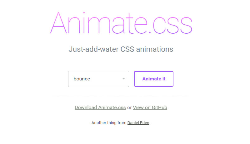
Animate 官網截圖
大家可以先到Animate官網下載Animate.css,下載完成後,將Animate.css載入至頁面中。
<link rel="stylesheet" type="text/css" href="animate.css">
準備完成後,可以直接對著想要做特效的標籤套上Animate的類別,類別名稱需與官網設定的名稱一樣,呈現特效的方式是在網頁載入完成後執行,下面是幾個簡單的範例。
參考Caroline製作bounceInDown效果:
<body>
  <div id="frog" class="animated bounceInDown" ></div>
</body>
參考Caroline製作zoomIn效果:
<div id="rainbow" class="animated zoomIn"></div>
參考Caroline製作的lightSpeedIn效果:
<div id="mrt" class="animated lightSpeedIn"></div>
搭配圖片後更可以呈現特效感覺。
接下來,我們還可以在指定物件,加入Animate的CSS來控制特效的時間,設定該物件特效的時間長短,例如彩虹,我們就可以讓它慢慢出現。
參考Caroline製作範例網頁:設定該物件特效過程的時間
<style>
*{ margin:0px; padding:px; border:none}

#rainbow{
  width:500px;
  height:164px;
  background-image:url(images/rainbow.png);
  -webkit-animation-duration: 3.5s;/*設定該物件特效過程的時間,3.5s代表3.5秒。*/
}
</style>
<div id="rainbow" class="animated zoomIn"></div>
參考Caroline製作範例網頁:設定該物件特效延遲多久出現,我們可以結合前面做的,效果更明顯。
<style>
#mrt{
  width:152px;
  height:62px;
  background-image:url(images/mrt.png);
  position:relative;
  bottom:100px;
  margin:auto;
  -webkit-animation-delay: 3.5s;/*指定該物件特效延遲開始,3.5s代表3.5秒。*/
}
</style>
<div id="mrt" class="animated lightSpeedIn"></div>
參考Caroline製作範例網頁:設定該物件特效次數。
<style>
#star{
  width:46px;
  height:45px;
  background-image:url(images/star1.png);
  -webkit-animation-iteration-count: infinite;/*設定該特效次數,infinite代表無限。*/
}
</style>
<div id="star" class="animated flash"></div>
懂得運用特效及時間的搭配後,就可以發揮你們的創意,做出喜歡的效果。
參考Caroline製作範例頁面:
物件很多,所以程式碼有點多,但其實都是很單純的CSS。
<style>
*{ padding:0px; margin:0px}
body{ background-color: #999;}
.clearLeft{ clear:left}
.floatLeft{ float: left}
#box{ width:1300px; height:800px; overflow:hidden; margin:auto; padding-top:30px;}
#cloud1{ width:130px; height:100px; background-image:url(images/cloud1.png); position:relative; left:-230px;-webkit-animation-duration: 20s;-webkit-animation-iteration-count: infinite;}/*設定雲朵特效過程長20秒,特效次數無限。*/
#cloud2{width:78px; height:63px; background-image:url(images/cloud2.png); position:relative; top:100px; right:-1300px;-webkit-animation-duration: 25s;-webkit-animation-iteration-count: infinite;}/*設定雲朵特效過程長25秒,特效次數無限*/
#cloud3{ width:130px; height:100px; background-image:url(images/cloud1.png); position:relative; top:200px; left:-330px;-webkit-animation-duration: 20s;-webkit-animation-iteration-count: infinite;-webkit-animation-delay: 2s;}/*設定雲朵特效過程長20秒,特效次數無限,且在頁面載入2秒後做特效*/

#star1{ width:45px; height:45px; background-image:url(images/star1.png);position:relative; left:50px;-webkit-animation-iteration-count: infinite;-webkit-animation-delay: 2s}/*設定星星特效次數無限,且在頁面載入2秒後做特效*/
#star2{ width:23px; height:23px; background-image:url(images/star2.png);position:relative; left:230px; top:80px;-webkit-animation-iteration-count: infinite;-webkit-animation-delay: 0.3s}/*設定星星特效次數無限,且在頁面載入0.3秒後做特效*/
#star3{ width:22px; height:22px; background-image:url(images/star3.png);position:relative; left:400px;-webkit-animation-iteration-count: infinite;-webkit-animation-delay: 0.5s }/*設定星星特效次數無限,且在頁面載入0.5秒後做特效*/
#star4{ width:41px; height:41px; background-image:url(images/star4.png);position:relative; left:580px ;top:100px; -webkit-animation-iteration-count: infinite;-webkit-animation-delay: 0.8s}/*設定星星特效次數無限,且在頁面載入0.8秒後做特效*/
#star5{ width:22px; height:23px; background-image:url(images/star5.png);position:relative; left:750px;top:50px; -webkit-animation-iteration-count: infinite;}/*設定星星特效次數無限*/
#panda{ width:166px; height:175px; background-image:url(images/panda2.png); position:relative; top:350px;-webkit-animation-delay: 3.0s}/*設定熊貓在頁面載入3.8秒後做特效*/
#frog{ width:159px; height:184px; background-image:url(images/frog2.png); position:relative; top:250px;-webkit-animation-delay: 4.1s}/*設定青蛙在頁面載入4.1秒後做特效*/
#taipei{ width:252px; height:442px; background-image:url(images/101.png);-webkit-animation-delay:4.9s;}/*設定101在頁面載入4.9秒後做特效*/
#ferriBox{ width:200px; height:270px; position:relative; top:5px; left:20px;-webkit-animation-delay:3.8s;}/*設定摩天輪在頁面載入3.8秒後做特效*/
#wheel{ width:199px; height:202px; background-image:url(images/wheel.png); position:relative; top:102px;left:-50px;}
#ferri{ width:82px; height:178px; background-image:url(images/ferri.png);}
#houseBox{-webkit-animation-delay:5s;}/*設定房子在頁面載入5秒後做特效*/
#heart1{ width:25px; height:23px; background-image:url(images/love1.png);margin-left:110px; margin-bottom:10px;-webkit-animation-delay:5.3s; }/*設定愛心在頁面載入5.3秒後做特效*/
#heart2{ width:33px; height:28px; background-image:url(images/love2.png);margin-left:80px; margin-bottom:20px;-webkit-animation-delay:5.9s;}/*設定愛心在頁面載入5.9秒後做特效*/
#heart3{ width:41px; height:41px; background-image:url(images/love3.png);margin-left:140px; -webkit-animation-delay:6.4s;}/*設定愛心在頁面載入6.4秒後做特效*/
#heart4{ width:60px; height:50px; background-image:url(images/love4.png);margin-left:70px; margin-bottom:10px;-webkit-animation-delay:7.0s;}/*設定愛心在頁面載入7.0秒後做特效*/
#heart5{ width:86px; height:84px; background-image:url(images/love5.png);margin-left:160px; margin-bottom:10px;-webkit-animation-delay:7.6s;}/*設定愛心在頁面載入7.6秒後做特效*/
#house{ width:116px; height:145px; background-image:url(images/house.png);margin-bottom:10px;}
#hello{ margin-top:25px; margin-left:8px;-webkit-animation-iteration-count: infinite;-webkit-animation-duration: 1.5s;}/*設定Hello特效次數無限,並且在頁面載入1.5秒後做特效*/
#bear{ width:187px; height:197px; background-image:url(images/bear.png); position:relative; top:340px;left:-160px;-webkit-animation-delay:4.4s}/*設定黑熊在頁面載入4.4秒後做特效*/
#balloonBox{-webkit-animation-delay:4.4s; position:relative}/*設定氣球在頁面載入4.4秒後做特效*/
#balloon{ width:78px; height:125px; background-image: url(images/balloon.png);position:relative; top:320px; left:-70px;-webkit-animation-delay:8.3s;-webkit-animation-duration: 20s; }/*設定氣球在頁面載入8.3秒後做特效,特效過程20秒*/
#rainbow{ width:1152px; height:378px; background-image:url(images/rainbowB.png); position:relative; bottom:100px;-webkit-animation-duration: 3.5s; }/*彩虹,設定特效過程3.5秒*/
</style>
<body>
<div id="box">
<div id="cloud1" class=" animated fadeInRightBig floatLeft"></div><!-- 使用fadeInRightBig是會從視窗外由右向左飛進來的效果-->
<div id="cloud2"class=" animated fadeInLeftBig floatLeft"></div>
<div id="cloud3" class=" animated fadeInRightBig floatLeft"></div>
<div id="star1"class=" animated flash clearLeft floatLeft"></div>
<div id="star2"class=" animated flash floatLeft"></div><!--flash 閃爍效果,可以運用在星星或閃光燈...上面-->
<div id="star3"class=" animated flash floatLeft"></div>
<div id="star4"class=" animated flash floatLeft"></div>
<div id="star5"class=" animated flash floatLeft"></div>
<div id="panda"class=" animated bounceInUp clearLeft floatLeft"></div><!--bounceInUp 熊貓彈上來的效果-->
<div id="frog"class=" animated bounceInDown floatLeft"></div><!--bounceInDown 青蛙跳下來的效果-->
<div id="taipei"class=" animated fadeIn floatLeft"></div><!--fadeIn 101淡入效果-->

<div id="ferriBox"class=" animated bounceIn floatLeft"><!--bounceIn 摩天輪彈進來的效果-->
 <div id="wheel" ></div>
 <div id="ferri"class=""></div>
</div>

<div id="houseBox"class=" animated zoomIn floatLeft"><!-- zoomIn 房子與愛心還有愛心上的字同時從遠到進的效果 -->
 <div id="heart5" class="animated fadeIn"><img class="animated tada" id="hello" src="images/hello.png" width="50" height="49"><!-- tada 設定Hello晃動的效果 --></div>
 <div id="heart4"class="animated fadeIn"></div><!-- fadeIn 設定愛心淡入的效果 -->
 <div id="heart3"class="animated fadeIn"></div>
 <div id="heart2"class="animated fadeIn"></div>
 <div id="heart1"class="animated fadeIn"></div>
 <div id="house"></div>
</div>
<!-- 為了讓氣球跟熊可以一起出現,最後氣球還可以飛到天上,所以用多個DIV包住,設定不同特效及時間。-->
<div id="balloonBox" class="animated bounceInRight floatLeft"><!--bounceInRight 氣球由右往左彈入效果-->
 <div id="balloon"class=" animated fadeOutUpBig floatLeft"></div><!--fadeOutUpBig 氣球往上飛效果-->
</div>

<div id="bear" class="animated bounceInRight floatLeft"></div><!--bounceInRight 黑熊由右往左彈入效果-->

<div id="rainbow" class="animated zoomIn clearLeft"></div><!--zoomIn 彩虹由遠到近的效果-->
</div>
</body>
最後,下面是幫大家整理出所有Animate的類別。
| bounce | bounceIn | bounceOutRight | fadeInRightBig |
| flash | bounceInDown | bounceOutUp | fadeInUp |
| pulse | bounceInLeft | fadeIn | fadeInUpBig |
| rubberBand | bounceInRight | fadeInDown | fadeOut |
| shake | bounceInUp | fadeInDownBig | fadeOutDown |
| swing | bounceOut | fadeInLeft | fadeOutDownBig |
| tada | bounceOutDown | fadeInLeftBig | fadeOutLeft |
| wobble | bounceOutLeft | fadeInRight | fadeOutLeftBig |
| flipInX | rotateIn | fadeOutUp | fadeOutUpBig |
| flipInY | rotateInDownLeft | rotateOutDownLeft | rollIn |
| flipOutX | rotateInDownRight | rotateOutDownRight | rollOut |
| flipOutY | rotateInUpLeft | rotateOutUpLeft | zoomIn |
| lightSpeedIn | rotateInUpRight | rotateOutUpRight | zoomInDown |
| lightSpeedOut | rotateOut | hinge | zoomInLeft |
| slideInDown | slideOutDown | zoomOutDown | zoomInRight |
| slideInLeft | slideOutLeft | zoomOutLeft | zoomInUp |
| slideInRight | slideOutRight | zoomOutRight | zoomOut |
| slideInUp | slideOutUp | zoomOutUp |

The one thing we can counsel, is the proof is in the pudding.
Apply it to titles, tags, descriptions, subtitles, and so on. An essential factor you
need to do right here is to search out related key phrases.
However it will possibly determine every small thing that has gone improper within the
marketing marketing campaign. Our Wasted Ad Spend report shows that 40% of
marketing teams are being hit with diminished budgets – so eliminating bot site visitors from your site is important to maximising your income.
By thinking through these questions and creating pins that reply them, you might be growing the possibilities of what you are promoting being put in front of
them. Taking the time up front to research and suppose via your target audience will make creating an effective Pinterest strategy so much simpler!
So as an alternative, focus on creating new content material, and
creating a number of different pins for that single piece of content
material to get the most from it. Pinterest analytics are a tremendous, free tool that can assist you learn more about your viewers and
create content that can enchantment to them, so make
the most of it!
Also visit my web page :: website traffic citations
Po poświęceniu 15-30 sekund na rejestrację, gracze otrzymują wiele korzyści. Oficjalni członkowie klubu mogą korzystać z bonusów, wypłacać pieniądze na kartę lub e-wallet, uruchamiać najlepsze sloty, czerpać maksymalną przyjemność z kręcenia jaskrawych bębnami. Twórca projektu hazardowego zadbał o korzystne warunki dla wszystkich odwiedzających.
hey there and thank you for your info – I have certainly picked up something new
from right here. I did however expertise a few technical issues using this site, as I experienced to reload the website many times previous to I could get it to load properly.
I had been wondering if your web host is OK? Not that I am complaining,
but sluggish loading instances times will sometimes affect your
placement in google and can damage your quality score if advertising and marketing with
Adwords. Well I’m adding this RSS to my email and can look out for much
more of your respective intriguing content.
Ensure that you update this again soon.
Yes! Finally someone writes about DCCVG768Q3.
mexican drug stores online: reliable mexican pharmacies – Mexican Pharm Inter
Hello are using WordPress for your blog platform?
I’m new to the blog world but I’m trying to get
started and set up my own. Do you need any coding expertise to make your own blog?
Any help would be greatly appreciated!
Good day! I just want to offer you a big thumbs up for the great info you have here on this
post. I am returning to your blog for more soon.
http://mexicanpharminter.com/# mexican drug stores online
canada drugstore pharmacy rx
There is certainly a lot to find out about this topic.
I love all of the points you have made.
https://mexicanpharminter.shop/# Mexican Pharm International
I was curious if you ever thought of changing the structure of
your website? Its very well written; I love what youve got to say.
But maybe you could a little more in the way of content so people could connect with it better.
Youve got an awful lot of text for only having 1 or two images.
Maybe you could space it out better?
Hello, I think your blog might be having browser compatibility issues.
When I look at your blog site in Chrome, it looks fine but when opening in Internet Explorer, it has some overlapping.
I just wanted to give you a quick heads up!
Other then that, great blog!
canadian neighbor pharmacy: canada pharmacy no prescription – canadian pharmacy store
http://interpharmonline.com/# canadian drug pharmacy
It’s very straightforward to find out any matter on web as compared to textbooks, as I found this paragraph at
this web page.
This design is spectacular! You most certainly know how to keep a reader amused.
Between your wit and your videos, I was almost moved to start my own blog (well,
almost…HaHa!) Wonderful job. I really loved what you had to say, and more
than that, how you presented it. Too cool!
canadian pharmacy meds reviews: Cheapest online pharmacy – legit canadian pharmacy
http://interpharmonline.com/# legit canadian online pharmacy
canadian world pharmacy
reputable canadian pharmacy [url=https://interpharmonline.com/#]Pharmacies in Canada that ship to the US[/url] canadian pharmacy near me
Hello, i think that i saw you visited my site thus i came to “return the
favor”.I am attempting to find things to improve my web site!I suppose
its ok to use some of your ideas!!
Hi, I think your website might be having browser compatibility issues.
When I look at your blog site in Opera, it looks fine but when opening in Internet Explorer, it has some overlapping.
I just wanted to give you a quick heads up! Other then that,
terrific blog!
iphone vs iphone 7
northwest pharmacy canada [url=https://interpharmonline.com/#]InterPharmOnline.com[/url] canadian king pharmacy
http://mexicanpharminter.com/# mexican drug stores online
IndiaMedFast.com: buying prescription drugs from india – online medicine shopping in india
apple iphone max iphone 17
Black-hat-seo.org est un site qui fournit des conseils, des stratégies et des outils pour les
professionnels du SEO. Il offre des informations précieuses pour
les propriétaires de sites, les rédacteurs et les marketeurs.
This design is steller! You definitely know how to keep a reader entertained.
Between your wit and your videos, I was almost moved to start my own blog (well, almost…HaHa!) Great job.
I really loved what you had to say, and more than that, how you presented it.
Too cool!
mexican drug stores online: mexican pharmacy online order – mexican pharmacy online order
https://indiamedfast.com/# cheapest online pharmacy india
canadian pharmacy mall