
Animate.CSS – 用CSS就可以做出的動態特效
Animate.CSS是一款集合了多種CSS3動態效果的CSS檔,在使用上相當方便,只要直接在需要製作特效的標籤上載入指定的CSS類別,就可以快速做出動畫效果,不過要特別注意,也因為他是CSS3的動畫效果,所以IE的部分需要使用9以上的版本才可以閱讀喔。
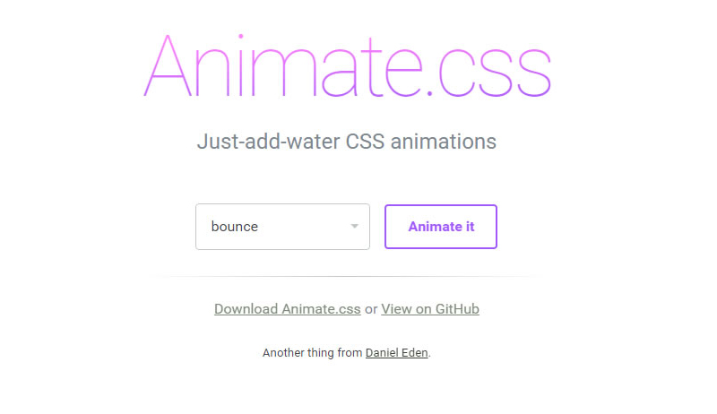
Animate 官網截圖
大家可以先到Animate官網下載Animate.css,下載完成後,將Animate.css載入至頁面中。
<link rel="stylesheet" type="text/css" href="animate.css">
準備完成後,可以直接對著想要做特效的標籤套上Animate的類別,類別名稱需與官網設定的名稱一樣,呈現特效的方式是在網頁載入完成後執行,下面是幾個簡單的範例。
參考Caroline製作bounceInDown效果:
<body>
  <div id="frog" class="animated bounceInDown" ></div>
</body>
參考Caroline製作zoomIn效果:
<div id="rainbow" class="animated zoomIn"></div>
參考Caroline製作的lightSpeedIn效果:
<div id="mrt" class="animated lightSpeedIn"></div>
搭配圖片後更可以呈現特效感覺。
接下來,我們還可以在指定物件,加入Animate的CSS來控制特效的時間,設定該物件特效的時間長短,例如彩虹,我們就可以讓它慢慢出現。
參考Caroline製作範例網頁:設定該物件特效過程的時間
<style>
*{ margin:0px; padding:px; border:none}

#rainbow{
  width:500px;
  height:164px;
  background-image:url(images/rainbow.png);
  -webkit-animation-duration: 3.5s;/*設定該物件特效過程的時間,3.5s代表3.5秒。*/
}
</style>
<div id="rainbow" class="animated zoomIn"></div>
參考Caroline製作範例網頁:設定該物件特效延遲多久出現,我們可以結合前面做的,效果更明顯。
<style>
#mrt{
  width:152px;
  height:62px;
  background-image:url(images/mrt.png);
  position:relative;
  bottom:100px;
  margin:auto;
  -webkit-animation-delay: 3.5s;/*指定該物件特效延遲開始,3.5s代表3.5秒。*/
}
</style>
<div id="mrt" class="animated lightSpeedIn"></div>
參考Caroline製作範例網頁:設定該物件特效次數。
<style>
#star{
  width:46px;
  height:45px;
  background-image:url(images/star1.png);
  -webkit-animation-iteration-count: infinite;/*設定該特效次數,infinite代表無限。*/
}
</style>
<div id="star" class="animated flash"></div>
懂得運用特效及時間的搭配後,就可以發揮你們的創意,做出喜歡的效果。
參考Caroline製作範例頁面:
物件很多,所以程式碼有點多,但其實都是很單純的CSS。
<style>
*{ padding:0px; margin:0px}
body{ background-color: #999;}
.clearLeft{ clear:left}
.floatLeft{ float: left}
#box{ width:1300px; height:800px; overflow:hidden; margin:auto; padding-top:30px;}
#cloud1{ width:130px; height:100px; background-image:url(images/cloud1.png); position:relative; left:-230px;-webkit-animation-duration: 20s;-webkit-animation-iteration-count: infinite;}/*設定雲朵特效過程長20秒,特效次數無限。*/
#cloud2{width:78px; height:63px; background-image:url(images/cloud2.png); position:relative; top:100px; right:-1300px;-webkit-animation-duration: 25s;-webkit-animation-iteration-count: infinite;}/*設定雲朵特效過程長25秒,特效次數無限*/
#cloud3{ width:130px; height:100px; background-image:url(images/cloud1.png); position:relative; top:200px; left:-330px;-webkit-animation-duration: 20s;-webkit-animation-iteration-count: infinite;-webkit-animation-delay: 2s;}/*設定雲朵特效過程長20秒,特效次數無限,且在頁面載入2秒後做特效*/

#star1{ width:45px; height:45px; background-image:url(images/star1.png);position:relative; left:50px;-webkit-animation-iteration-count: infinite;-webkit-animation-delay: 2s}/*設定星星特效次數無限,且在頁面載入2秒後做特效*/
#star2{ width:23px; height:23px; background-image:url(images/star2.png);position:relative; left:230px; top:80px;-webkit-animation-iteration-count: infinite;-webkit-animation-delay: 0.3s}/*設定星星特效次數無限,且在頁面載入0.3秒後做特效*/
#star3{ width:22px; height:22px; background-image:url(images/star3.png);position:relative; left:400px;-webkit-animation-iteration-count: infinite;-webkit-animation-delay: 0.5s }/*設定星星特效次數無限,且在頁面載入0.5秒後做特效*/
#star4{ width:41px; height:41px; background-image:url(images/star4.png);position:relative; left:580px ;top:100px; -webkit-animation-iteration-count: infinite;-webkit-animation-delay: 0.8s}/*設定星星特效次數無限,且在頁面載入0.8秒後做特效*/
#star5{ width:22px; height:23px; background-image:url(images/star5.png);position:relative; left:750px;top:50px; -webkit-animation-iteration-count: infinite;}/*設定星星特效次數無限*/
#panda{ width:166px; height:175px; background-image:url(images/panda2.png); position:relative; top:350px;-webkit-animation-delay: 3.0s}/*設定熊貓在頁面載入3.8秒後做特效*/
#frog{ width:159px; height:184px; background-image:url(images/frog2.png); position:relative; top:250px;-webkit-animation-delay: 4.1s}/*設定青蛙在頁面載入4.1秒後做特效*/
#taipei{ width:252px; height:442px; background-image:url(images/101.png);-webkit-animation-delay:4.9s;}/*設定101在頁面載入4.9秒後做特效*/
#ferriBox{ width:200px; height:270px; position:relative; top:5px; left:20px;-webkit-animation-delay:3.8s;}/*設定摩天輪在頁面載入3.8秒後做特效*/
#wheel{ width:199px; height:202px; background-image:url(images/wheel.png); position:relative; top:102px;left:-50px;}
#ferri{ width:82px; height:178px; background-image:url(images/ferri.png);}
#houseBox{-webkit-animation-delay:5s;}/*設定房子在頁面載入5秒後做特效*/
#heart1{ width:25px; height:23px; background-image:url(images/love1.png);margin-left:110px; margin-bottom:10px;-webkit-animation-delay:5.3s; }/*設定愛心在頁面載入5.3秒後做特效*/
#heart2{ width:33px; height:28px; background-image:url(images/love2.png);margin-left:80px; margin-bottom:20px;-webkit-animation-delay:5.9s;}/*設定愛心在頁面載入5.9秒後做特效*/
#heart3{ width:41px; height:41px; background-image:url(images/love3.png);margin-left:140px; -webkit-animation-delay:6.4s;}/*設定愛心在頁面載入6.4秒後做特效*/
#heart4{ width:60px; height:50px; background-image:url(images/love4.png);margin-left:70px; margin-bottom:10px;-webkit-animation-delay:7.0s;}/*設定愛心在頁面載入7.0秒後做特效*/
#heart5{ width:86px; height:84px; background-image:url(images/love5.png);margin-left:160px; margin-bottom:10px;-webkit-animation-delay:7.6s;}/*設定愛心在頁面載入7.6秒後做特效*/
#house{ width:116px; height:145px; background-image:url(images/house.png);margin-bottom:10px;}
#hello{ margin-top:25px; margin-left:8px;-webkit-animation-iteration-count: infinite;-webkit-animation-duration: 1.5s;}/*設定Hello特效次數無限,並且在頁面載入1.5秒後做特效*/
#bear{ width:187px; height:197px; background-image:url(images/bear.png); position:relative; top:340px;left:-160px;-webkit-animation-delay:4.4s}/*設定黑熊在頁面載入4.4秒後做特效*/
#balloonBox{-webkit-animation-delay:4.4s; position:relative}/*設定氣球在頁面載入4.4秒後做特效*/
#balloon{ width:78px; height:125px; background-image: url(images/balloon.png);position:relative; top:320px; left:-70px;-webkit-animation-delay:8.3s;-webkit-animation-duration: 20s; }/*設定氣球在頁面載入8.3秒後做特效,特效過程20秒*/
#rainbow{ width:1152px; height:378px; background-image:url(images/rainbowB.png); position:relative; bottom:100px;-webkit-animation-duration: 3.5s; }/*彩虹,設定特效過程3.5秒*/
</style>
<body>
<div id="box">
<div id="cloud1" class=" animated fadeInRightBig floatLeft"></div><!-- 使用fadeInRightBig是會從視窗外由右向左飛進來的效果-->
<div id="cloud2"class=" animated fadeInLeftBig floatLeft"></div>
<div id="cloud3" class=" animated fadeInRightBig floatLeft"></div>
<div id="star1"class=" animated flash clearLeft floatLeft"></div>
<div id="star2"class=" animated flash floatLeft"></div><!--flash 閃爍效果,可以運用在星星或閃光燈...上面-->
<div id="star3"class=" animated flash floatLeft"></div>
<div id="star4"class=" animated flash floatLeft"></div>
<div id="star5"class=" animated flash floatLeft"></div>
<div id="panda"class=" animated bounceInUp clearLeft floatLeft"></div><!--bounceInUp 熊貓彈上來的效果-->
<div id="frog"class=" animated bounceInDown floatLeft"></div><!--bounceInDown 青蛙跳下來的效果-->
<div id="taipei"class=" animated fadeIn floatLeft"></div><!--fadeIn 101淡入效果-->

<div id="ferriBox"class=" animated bounceIn floatLeft"><!--bounceIn 摩天輪彈進來的效果-->
 <div id="wheel" ></div>
 <div id="ferri"class=""></div>
</div>

<div id="houseBox"class=" animated zoomIn floatLeft"><!-- zoomIn 房子與愛心還有愛心上的字同時從遠到進的效果 -->
 <div id="heart5" class="animated fadeIn"><img class="animated tada" id="hello" src="images/hello.png" width="50" height="49"><!-- tada 設定Hello晃動的效果 --></div>
 <div id="heart4"class="animated fadeIn"></div><!-- fadeIn 設定愛心淡入的效果 -->
 <div id="heart3"class="animated fadeIn"></div>
 <div id="heart2"class="animated fadeIn"></div>
 <div id="heart1"class="animated fadeIn"></div>
 <div id="house"></div>
</div>
<!-- 為了讓氣球跟熊可以一起出現,最後氣球還可以飛到天上,所以用多個DIV包住,設定不同特效及時間。-->
<div id="balloonBox" class="animated bounceInRight floatLeft"><!--bounceInRight 氣球由右往左彈入效果-->
 <div id="balloon"class=" animated fadeOutUpBig floatLeft"></div><!--fadeOutUpBig 氣球往上飛效果-->
</div>

<div id="bear" class="animated bounceInRight floatLeft"></div><!--bounceInRight 黑熊由右往左彈入效果-->

<div id="rainbow" class="animated zoomIn clearLeft"></div><!--zoomIn 彩虹由遠到近的效果-->
</div>
</body>
最後,下面是幫大家整理出所有Animate的類別。
| bounce | bounceIn | bounceOutRight | fadeInRightBig |
| flash | bounceInDown | bounceOutUp | fadeInUp |
| pulse | bounceInLeft | fadeIn | fadeInUpBig |
| rubberBand | bounceInRight | fadeInDown | fadeOut |
| shake | bounceInUp | fadeInDownBig | fadeOutDown |
| swing | bounceOut | fadeInLeft | fadeOutDownBig |
| tada | bounceOutDown | fadeInLeftBig | fadeOutLeft |
| wobble | bounceOutLeft | fadeInRight | fadeOutLeftBig |
| flipInX | rotateIn | fadeOutUp | fadeOutUpBig |
| flipInY | rotateInDownLeft | rotateOutDownLeft | rollIn |
| flipOutX | rotateInDownRight | rotateOutDownRight | rollOut |
| flipOutY | rotateInUpLeft | rotateOutUpLeft | zoomIn |
| lightSpeedIn | rotateInUpRight | rotateOutUpRight | zoomInDown |
| lightSpeedOut | rotateOut | hinge | zoomInLeft |
| slideInDown | slideOutDown | zoomOutDown | zoomInRight |
| slideInLeft | slideOutLeft | zoomOutLeft | zoomInUp |
| slideInRight | slideOutRight | zoomOutRight | zoomOut |
| slideInUp | slideOutUp | zoomOutUp |

Купить диплом университета по доступной цене вы можете, обратившись к проверенной специализированной компании. Купить документ ВУЗа вы имеете возможность в нашем сервисе. [url=http://diplomaj-v-tule.ru/kupit-diplom-menedzhera-s-zaneseniem-v-reestr-vigodno-2/]diplomaj-v-tule.ru/kupit-diplom-menedzhera-s-zaneseniem-v-reestr-vigodno-2[/url]
1win casino [url=1win16.com.ng]1win16.com.ng[/url] .
Заказать диплом института по выгодной цене вы сможете, обращаясь к проверенной специализированной компании. Приобрести документ о получении высшего образования вы имеете возможность у нас в Москве. [url=http://diplom-kaluga.ru/kupit-diplom-v-reestre-bistro-i-nadezhno-6/]diplom-kaluga.ru/kupit-diplom-v-reestre-bistro-i-nadezhno-6[/url]
https://usaindiapharm.com/# UsaIndiaPharm
управление репутацией криптовалюты [url=https://prodvizhenie-kriptovalyuta1.ru/]prodvizhenie-kriptovalyuta1.ru[/url] .
Приобрести диплом ВУЗа по доступной цене можно, обращаясь к надежной специализированной фирме. Заказать документ ВУЗа можно у нас в столице. [url=http://dip-lom-rus.ru/diplom-s-zaneseniem-v-reestr-dlya-vashego-uspexa-8/]dip-lom-rus.ru/diplom-s-zaneseniem-v-reestr-dlya-vashego-uspexa-8[/url]
register with 1win website [url=http://1win16.com.ng]http://1win16.com.ng[/url] .
serm криптовалюты [url=prodvizhenie-kriptovalyuta1.ru]serm криптовалюты[/url] .
промокод prodamus [url=http://promokod-prdms.ru/]http://promokod-prdms.ru/[/url] .
управление репутацией криптовалюты [url=www.prodvizhenie-kriptovalyuta1.ru/]www.prodvizhenie-kriptovalyuta1.ru/[/url] .
промокод на продамус [url=https://promokod-prdms.ru]промокод на продамус[/url] .
Yesterday, while I was at work, my sister stole my apple ipad
and tested to see if it can survive a 30 foot drop, just
so she can be a youtube sensation. My apple ipad is now broken and she
has 83 views. I know this is entirely off topic but I
had to share it with someone!
pharmacy website india: buy prescription drugs from india – top 10 pharmacies in india
Excellent write-up! News releases are crucial for shaping
media coverage and conveying significant details.
They aid develop connections between organizations and reporters.
Developing successful press releases necessitates being clear, matched with the concerns of targeted press contacts.
In today’s digital age, press releases further serve a
important role in online PR strategies. They merely target classic news outlets but furthermore increase engagement and enhance a business’s online footprint.
Integrating multimedia elements, such as clips, can turn press
releases further appealing and accessible. Adapting to the evolving media field while keeping core values can substantially
boost a press release’s effect. What are your thoughts on leveraging multimedia in public announcements?
Here is my webpage … Pressez (http://Center.Kosin.Ac.Kr/Cems//Bbs/Board.Php?Bo_Table=Free&Wr_Id=1145868)
продамус промокоды [url=https://promokod-prdms.ru]продамус промокоды[/url] .
This post is actually a nice one it assists new web people, who are wishing for blogging.
клининг недорого спб https://cleaning-top24.ru
Every weekend i used to pay a quick visit this site, for the reason that i wish for enjoyment, as
this this web page conations truly good funny
information too.
1 win moldova [url=www.1win5024.ru]www.1win5024.ru[/url] .
Заказать диплом на заказ возможно через сайт компании. [url=http://repetitor.ekafe.ru/faq.php/]repetitor.ekafe.ru/faq.php[/url]
Купить диплом можно используя официальный портал компании. [url=http://only-entrepreneurs.com/read-blog/13911_kupit-oficialnyj-diplom-s-zaneseniem-v-reestr.html/]only-entrepreneurs.com/read-blog/13911_kupit-oficialnyj-diplom-s-zaneseniem-v-reestr.html[/url]
Hi there to every one, the contents present at this
web site are actually awesome for people experience, well,
keep up the good work fellows.
best online pharmacy india: indian pharmacy online – UsaIndiaPharm
http://usaindiapharm.com/# online pharmacy india
My family every time say that I am wasting my time
here at web, but I know I am getting knowledge every day by reading thes
pleasant articles.
No matter if some one searches for his essential thing, thus he/she wishes to be available that in detail,
therefore that thing is maintained over here.
промокод на продамус [url=https://promokod-prdms.ru/]промокод на продамус[/url] .
seo криптопроекта [url=http://prodvizhenie-kriptovalyuta1.ru]http://prodvizhenie-kriptovalyuta1.ru[/url] .
1вин сайт [url=http://1win5030.ru]http://1win5030.ru[/url] .
промокод продамус [url=www.promokod-prdms.ru/]промокод продамус[/url] .