
Animate.CSS – 用CSS就可以做出的動態特效
Animate.CSS是一款集合了多種CSS3動態效果的CSS檔,在使用上相當方便,只要直接在需要製作特效的標籤上載入指定的CSS類別,就可以快速做出動畫效果,不過要特別注意,也因為他是CSS3的動畫效果,所以IE的部分需要使用9以上的版本才可以閱讀喔。
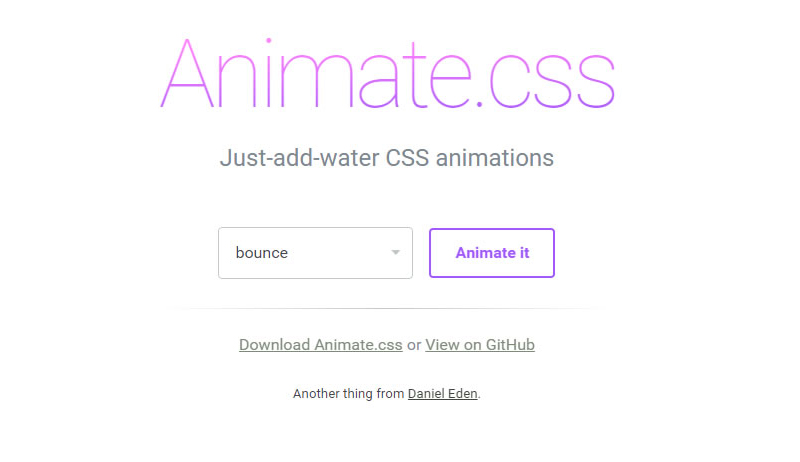
Animate 官網截圖
大家可以先到Animate官網下載Animate.css,下載完成後,將Animate.css載入至頁面中。
<link rel="stylesheet" type="text/css" href="animate.css">
準備完成後,可以直接對著想要做特效的標籤套上Animate的類別,類別名稱需與官網設定的名稱一樣,呈現特效的方式是在網頁載入完成後執行,下面是幾個簡單的範例。
參考Caroline製作bounceInDown效果:
<body>
  <div id="frog" class="animated bounceInDown" ></div>
</body>
參考Caroline製作zoomIn效果:
<div id="rainbow" class="animated zoomIn"></div>
參考Caroline製作的lightSpeedIn效果:
<div id="mrt" class="animated lightSpeedIn"></div>
搭配圖片後更可以呈現特效感覺。
接下來,我們還可以在指定物件,加入Animate的CSS來控制特效的時間,設定該物件特效的時間長短,例如彩虹,我們就可以讓它慢慢出現。
參考Caroline製作範例網頁:設定該物件特效過程的時間
<style>
*{ margin:0px; padding:px; border:none}

#rainbow{
  width:500px;
  height:164px;
  background-image:url(images/rainbow.png);
  -webkit-animation-duration: 3.5s;/*設定該物件特效過程的時間,3.5s代表3.5秒。*/
}
</style>
<div id="rainbow" class="animated zoomIn"></div>
參考Caroline製作範例網頁:設定該物件特效延遲多久出現,我們可以結合前面做的,效果更明顯。
<style>
#mrt{
  width:152px;
  height:62px;
  background-image:url(images/mrt.png);
  position:relative;
  bottom:100px;
  margin:auto;
  -webkit-animation-delay: 3.5s;/*指定該物件特效延遲開始,3.5s代表3.5秒。*/
}
</style>
<div id="mrt" class="animated lightSpeedIn"></div>
參考Caroline製作範例網頁:設定該物件特效次數。
<style>
#star{
  width:46px;
  height:45px;
  background-image:url(images/star1.png);
  -webkit-animation-iteration-count: infinite;/*設定該特效次數,infinite代表無限。*/
}
</style>
<div id="star" class="animated flash"></div>
懂得運用特效及時間的搭配後,就可以發揮你們的創意,做出喜歡的效果。
參考Caroline製作範例頁面:
物件很多,所以程式碼有點多,但其實都是很單純的CSS。
<style>
*{ padding:0px; margin:0px}
body{ background-color: #999;}
.clearLeft{ clear:left}
.floatLeft{ float: left}
#box{ width:1300px; height:800px; overflow:hidden; margin:auto; padding-top:30px;}
#cloud1{ width:130px; height:100px; background-image:url(images/cloud1.png); position:relative; left:-230px;-webkit-animation-duration: 20s;-webkit-animation-iteration-count: infinite;}/*設定雲朵特效過程長20秒,特效次數無限。*/
#cloud2{width:78px; height:63px; background-image:url(images/cloud2.png); position:relative; top:100px; right:-1300px;-webkit-animation-duration: 25s;-webkit-animation-iteration-count: infinite;}/*設定雲朵特效過程長25秒,特效次數無限*/
#cloud3{ width:130px; height:100px; background-image:url(images/cloud1.png); position:relative; top:200px; left:-330px;-webkit-animation-duration: 20s;-webkit-animation-iteration-count: infinite;-webkit-animation-delay: 2s;}/*設定雲朵特效過程長20秒,特效次數無限,且在頁面載入2秒後做特效*/

#star1{ width:45px; height:45px; background-image:url(images/star1.png);position:relative; left:50px;-webkit-animation-iteration-count: infinite;-webkit-animation-delay: 2s}/*設定星星特效次數無限,且在頁面載入2秒後做特效*/
#star2{ width:23px; height:23px; background-image:url(images/star2.png);position:relative; left:230px; top:80px;-webkit-animation-iteration-count: infinite;-webkit-animation-delay: 0.3s}/*設定星星特效次數無限,且在頁面載入0.3秒後做特效*/
#star3{ width:22px; height:22px; background-image:url(images/star3.png);position:relative; left:400px;-webkit-animation-iteration-count: infinite;-webkit-animation-delay: 0.5s }/*設定星星特效次數無限,且在頁面載入0.5秒後做特效*/
#star4{ width:41px; height:41px; background-image:url(images/star4.png);position:relative; left:580px ;top:100px; -webkit-animation-iteration-count: infinite;-webkit-animation-delay: 0.8s}/*設定星星特效次數無限,且在頁面載入0.8秒後做特效*/
#star5{ width:22px; height:23px; background-image:url(images/star5.png);position:relative; left:750px;top:50px; -webkit-animation-iteration-count: infinite;}/*設定星星特效次數無限*/
#panda{ width:166px; height:175px; background-image:url(images/panda2.png); position:relative; top:350px;-webkit-animation-delay: 3.0s}/*設定熊貓在頁面載入3.8秒後做特效*/
#frog{ width:159px; height:184px; background-image:url(images/frog2.png); position:relative; top:250px;-webkit-animation-delay: 4.1s}/*設定青蛙在頁面載入4.1秒後做特效*/
#taipei{ width:252px; height:442px; background-image:url(images/101.png);-webkit-animation-delay:4.9s;}/*設定101在頁面載入4.9秒後做特效*/
#ferriBox{ width:200px; height:270px; position:relative; top:5px; left:20px;-webkit-animation-delay:3.8s;}/*設定摩天輪在頁面載入3.8秒後做特效*/
#wheel{ width:199px; height:202px; background-image:url(images/wheel.png); position:relative; top:102px;left:-50px;}
#ferri{ width:82px; height:178px; background-image:url(images/ferri.png);}
#houseBox{-webkit-animation-delay:5s;}/*設定房子在頁面載入5秒後做特效*/
#heart1{ width:25px; height:23px; background-image:url(images/love1.png);margin-left:110px; margin-bottom:10px;-webkit-animation-delay:5.3s; }/*設定愛心在頁面載入5.3秒後做特效*/
#heart2{ width:33px; height:28px; background-image:url(images/love2.png);margin-left:80px; margin-bottom:20px;-webkit-animation-delay:5.9s;}/*設定愛心在頁面載入5.9秒後做特效*/
#heart3{ width:41px; height:41px; background-image:url(images/love3.png);margin-left:140px; -webkit-animation-delay:6.4s;}/*設定愛心在頁面載入6.4秒後做特效*/
#heart4{ width:60px; height:50px; background-image:url(images/love4.png);margin-left:70px; margin-bottom:10px;-webkit-animation-delay:7.0s;}/*設定愛心在頁面載入7.0秒後做特效*/
#heart5{ width:86px; height:84px; background-image:url(images/love5.png);margin-left:160px; margin-bottom:10px;-webkit-animation-delay:7.6s;}/*設定愛心在頁面載入7.6秒後做特效*/
#house{ width:116px; height:145px; background-image:url(images/house.png);margin-bottom:10px;}
#hello{ margin-top:25px; margin-left:8px;-webkit-animation-iteration-count: infinite;-webkit-animation-duration: 1.5s;}/*設定Hello特效次數無限,並且在頁面載入1.5秒後做特效*/
#bear{ width:187px; height:197px; background-image:url(images/bear.png); position:relative; top:340px;left:-160px;-webkit-animation-delay:4.4s}/*設定黑熊在頁面載入4.4秒後做特效*/
#balloonBox{-webkit-animation-delay:4.4s; position:relative}/*設定氣球在頁面載入4.4秒後做特效*/
#balloon{ width:78px; height:125px; background-image: url(images/balloon.png);position:relative; top:320px; left:-70px;-webkit-animation-delay:8.3s;-webkit-animation-duration: 20s; }/*設定氣球在頁面載入8.3秒後做特效,特效過程20秒*/
#rainbow{ width:1152px; height:378px; background-image:url(images/rainbowB.png); position:relative; bottom:100px;-webkit-animation-duration: 3.5s; }/*彩虹,設定特效過程3.5秒*/
</style>
<body>
<div id="box">
<div id="cloud1" class=" animated fadeInRightBig floatLeft"></div><!-- 使用fadeInRightBig是會從視窗外由右向左飛進來的效果-->
<div id="cloud2"class=" animated fadeInLeftBig floatLeft"></div>
<div id="cloud3" class=" animated fadeInRightBig floatLeft"></div>
<div id="star1"class=" animated flash clearLeft floatLeft"></div>
<div id="star2"class=" animated flash floatLeft"></div><!--flash 閃爍效果,可以運用在星星或閃光燈...上面-->
<div id="star3"class=" animated flash floatLeft"></div>
<div id="star4"class=" animated flash floatLeft"></div>
<div id="star5"class=" animated flash floatLeft"></div>
<div id="panda"class=" animated bounceInUp clearLeft floatLeft"></div><!--bounceInUp 熊貓彈上來的效果-->
<div id="frog"class=" animated bounceInDown floatLeft"></div><!--bounceInDown 青蛙跳下來的效果-->
<div id="taipei"class=" animated fadeIn floatLeft"></div><!--fadeIn 101淡入效果-->

<div id="ferriBox"class=" animated bounceIn floatLeft"><!--bounceIn 摩天輪彈進來的效果-->
 <div id="wheel" ></div>
 <div id="ferri"class=""></div>
</div>

<div id="houseBox"class=" animated zoomIn floatLeft"><!-- zoomIn 房子與愛心還有愛心上的字同時從遠到進的效果 -->
 <div id="heart5" class="animated fadeIn"><img class="animated tada" id="hello" src="images/hello.png" width="50" height="49"><!-- tada 設定Hello晃動的效果 --></div>
 <div id="heart4"class="animated fadeIn"></div><!-- fadeIn 設定愛心淡入的效果 -->
 <div id="heart3"class="animated fadeIn"></div>
 <div id="heart2"class="animated fadeIn"></div>
 <div id="heart1"class="animated fadeIn"></div>
 <div id="house"></div>
</div>
<!-- 為了讓氣球跟熊可以一起出現,最後氣球還可以飛到天上,所以用多個DIV包住,設定不同特效及時間。-->
<div id="balloonBox" class="animated bounceInRight floatLeft"><!--bounceInRight 氣球由右往左彈入效果-->
 <div id="balloon"class=" animated fadeOutUpBig floatLeft"></div><!--fadeOutUpBig 氣球往上飛效果-->
</div>

<div id="bear" class="animated bounceInRight floatLeft"></div><!--bounceInRight 黑熊由右往左彈入效果-->

<div id="rainbow" class="animated zoomIn clearLeft"></div><!--zoomIn 彩虹由遠到近的效果-->
</div>
</body>
最後,下面是幫大家整理出所有Animate的類別。
| bounce | bounceIn | bounceOutRight | fadeInRightBig |
| flash | bounceInDown | bounceOutUp | fadeInUp |
| pulse | bounceInLeft | fadeIn | fadeInUpBig |
| rubberBand | bounceInRight | fadeInDown | fadeOut |
| shake | bounceInUp | fadeInDownBig | fadeOutDown |
| swing | bounceOut | fadeInLeft | fadeOutDownBig |
| tada | bounceOutDown | fadeInLeftBig | fadeOutLeft |
| wobble | bounceOutLeft | fadeInRight | fadeOutLeftBig |
| flipInX | rotateIn | fadeOutUp | fadeOutUpBig |
| flipInY | rotateInDownLeft | rotateOutDownLeft | rollIn |
| flipOutX | rotateInDownRight | rotateOutDownRight | rollOut |
| flipOutY | rotateInUpLeft | rotateOutUpLeft | zoomIn |
| lightSpeedIn | rotateInUpRight | rotateOutUpRight | zoomInDown |
| lightSpeedOut | rotateOut | hinge | zoomInLeft |
| slideInDown | slideOutDown | zoomOutDown | zoomInRight |
| slideInLeft | slideOutLeft | zoomOutLeft | zoomInUp |
| slideInRight | slideOutRight | zoomOutRight | zoomOut |
| slideInUp | slideOutUp | zoomOutUp |


mostbet игры [url=www.mostbet5002.ru]www.mostbet5002.ru[/url] .
I’m gone to convey my little brother, that he should also
pay a quick visit this web site on regular basis to
get updated from newest reports.
When I originally left a comment I appear to have clicked the -Notify me when new comments are added- checkbox
and now every time a comment is added I recieve four emails with the exact same comment.
Is there a means you can remove me from that service?
Thanks a lot!
trustpilot отзывы [url=https://prodvizhenie-kriptovalyuta1.ru/]trustpilot отзывы[/url] .
serm криптовалюты [url=https://prodvizhenie-kriptovalyuta1.ru/]serm криптовалюты[/url] .
повышение доверия криптовалюты [url=https://prodvizhenie-kriptovalyuta1.ru/]повышение доверия криптовалюты[/url] .
This is the right web site for anybody who wants to understand this topic.
You know so much its almost hard to argue with you (not that I personally would want to…HaHa).
You definitely put a brand new spin on a subject that has been discussed for years.
Wonderful stuff, just great!
промокод на продамус [url=https://promokod-prdms.ru/]промокод на продамус[/url] .
промокод продамус на 5000 [url=www.promokod-prdms.ru/]www.promokod-prdms.ru/[/url] .
промокод продамус на 5000 [url=www.promokod-prdms.ru]www.promokod-prdms.ru[/url] .
I know this if off topic but I’m looking into starting my own blog and was curious what all is required to get setup? I’m assuming having a blog like yours would cost a pretty penny? I’m not very web smart so I’m not 100 certain. Any recommendations or advice would be greatly appreciated. Kudos
Howdy! I know this is kinda off topic however , I’d figured I’d ask.
Would you be interested in exchanging links or maybe guest authoring a blog article or
vice-versa? My blog covers a lot of the same topics as yours and I believe we could greatly benefit from each other.
If you are interested feel free to shoot me an e-mail. I look forward to hearing from you!
Great blog by the way!
I would like to thank you for the efforts you have put in writing this site. I’m hoping the same high-grade site post from you in the upcoming also. Actually your creative writing skills has inspired me to get my own blog now. Really the blogging is spreading its wings quickly. Your write up is a great example of it.
We are a group of volunteers and starting a new scheme in our community.
Your site offered us with valuable information to work on.
You have done an impressive job and our whole community
will be thankful to you.
Vital press releases are Molding media Messages.
They Support build Connections between Businesses
and Journalists. Crafting Effective press releases Necessitates being Focused, Relevant with the Concerns of Chosen News Channels.
In Today’s Digital Age, press releases Likewise Function A Vital role
in Digital Outreach. They Reach Mainstream news outlets
Also Drive Interest and Improve a Organization’s Web Presence.
Adding Multimedia Elements, such as Photos, can Render press releases Significantly Interesting and Accessible.
Modifying to the Dynamic media Environment while Upholding core Values can Significantly Increase a press release’s Influence.
What Are Your Thoughts on Usijng multimedia in Public Announcements?
Look at my web blog Pressez (Vista.Su.Domains)
UsaIndiaPharm [url=https://usaindiapharm.com/#]best india pharmacy[/url] top 10 online pharmacy in india
Do you mind if I quote a couple of your articles as
long as I provide credit and sources back to your website?
My website is in the exact same niche as yours and my users
would definitely benefit from some of the information you present here.
Please let me know if this alright with you. Regards!
Заказать диплом на заказ в столице вы имеете возможность используя официальный сайт компании. [url=http://facetwig.com/read-blog/154419_kupit-diplom-o-srednem-obrazovanii-v-reestr.html/]facetwig.com/read-blog/154419_kupit-diplom-o-srednem-obrazovanii-v-reestr.html[/url]
USA India Pharm: UsaIndiaPharm – reputable indian online pharmacy
Приобрести диплом на заказ в столице можно через официальный портал компании. [url=http://social.elpaso.world/read-blog/6236_kupit-diplom-s-reestrom.html/]social.elpaso.world/read-blog/6236_kupit-diplom-s-reestrom.html[/url]
Thank you for the good writeup. It in fact was a amusement
account it. Look advanced to more added agreeable from you!
By the way, how could we communicate?
Купить диплом под заказ в Москве возможно через сайт компании. [url=http://school97.ru/vesti/view_profile.phpUID=221134/]school97.ru/vesti/view_profile.phpUID=221134[/url]
Hello, just wanted to mention, I enjoyed this post.
It was helpful. Keep on posting!
You’re so awesome! I don’t think I’ve truly read something like that before.
So good to discover another person with a few unique thoughts on this subject matter.
Really.. thank you for starting this up. This website is one thing that’s needed on the
web, someone with some originality!
best online pharmacy india: UsaIndiaPharm – UsaIndiaPharm
повышение рейтинга криптовалюты [url=http://www.prodvizhenie-kriptovalyuta1.ru]повышение рейтинга криптовалюты[/url] .
Профессиональный сервисный центр по ремонту бытовой техники с выездом на дом.
Мы предлагаем:сервис центры бытовой техники москва
Наши мастера оперативно устранят неисправности вашего устройства в сервисе или с выездом на дом!
appstore отзывы [url=https://prodvizhenie-kriptovalyuta1.ru/]appstore отзывы[/url] .
seo продвижение телеграм [url=https://prodvizhenie-kriptovalyuta1.ru/]https://prodvizhenie-kriptovalyuta1.ru/[/url] .
продамус промокод скидка на подключение [url=http://promokod-prdms.ru]продамус промокод скидка на подключение[/url] .